

|
|
| The Script |
 I wanted a scriptable bar graph generator for my PhD
thesis that supported stacked and clustered bars, but couldn't find one
that played well with latex and had all the features I wanted, so I built
my own. I followed the scheme of Graham
Williams' barchart shell script to have gnuplot produce fig output and
then mangle it to fill in the bars. I added support for more than just two
or three clustered datasets and support for stacked bars, as well as
automatic averaging and other features.
I wanted a scriptable bar graph generator for my PhD
thesis that supported stacked and clustered bars, but couldn't find one
that played well with latex and had all the features I wanted, so I built
my own. I followed the scheme of Graham
Williams' barchart shell script to have gnuplot produce fig output and
then mangle it to fill in the bars. I added support for more than just two
or three clustered datasets and support for stacked bars, as well as
automatic averaging and other features.
The script is bargraph.pl, released under the GPL. A package that includes the script and samples is also available.
Features:
| Usage |
The script's usage message shows the command-line options:
Usage: bargraph.pl [-gnuplot] [-fig] [-pdf] [-png [-non-transparent]] [-eps] <graphfile>

File format:
<graph parameters>
<data>

Graph parameter types:
<value_param>=<value>
=<bool_param>
The script takes in a single file that specifies the data to graph and control parameters for customizing the graph. The parameters must precede the data in the file. Comments can be included in a graph file following the # character.
The script's output, by default, is encapsulated postscript (.eps), which is sent to stdout. Simply redirect it to the desired output file:
bargraph.pl mygraphfile > mygraphfile.eps
The script first produces data to send to gnuplot, which can be seen by specifying -gnuplot. Next, the script takes the resulting fig output from gnuplot and post-processes it to fill in the bars. The final fig data can also be selected via -fig. This data is then sent to fig2dev to produce a final figure.
I keep my data in .perf files and have my Makefile generate .eps for latex and .png for slides or web pages. See converting to non-vector formats for notes on avoiding aliasing and other problems when creating images, and for some Makefile rules. My script magnifies 2x when converting to png to help avoid these problems, but for most uses that's not enough and you should follow my suggestions rather than using -png. My default for -png produces a transparent background; the -non-transparent option disables that feature.
The following sections describe each graph parameter.
| Multiple Datasets |
=cluster
Indicates that there are multiple datasets that should be displayed as
clustered bars. This command also provides the names of the datasets.
The character following =cluster is taken as a delimiter separating
the rest of the line into strings naming each dataset. Some examples:
     =cluster;Irish elk;Dodo birds;Coelecanth
     =cluster Monday Tuesday Wednesday Thursday Friday
     =cluster+Fast; slow+Slow; fast
The data itself must either be in table format or
each dataset must be separated by =multi.
=stacked
Just like =cluster, this indicates that there
are multiple datasets, but to be displayed as stacked bars rather than
clustered bars. The data must be either in table
format or delimited by =multi. The names of
the datasets are delimited as with =cluster:
=stacked,Irish elk,Dodo birds,Coelecanth
=stackabs
Stacked data is normally given in relative values that are added
to produce the absolute values of each bar. This option indicates
that each datum is an absolute value. As an example, consider this data:
foo 10 20 30
By default this would be stacked at 10, 30, and 60, with the given
values indicating the difference between each stacked bar's height.
With =stackabs the bars would have heights of 10, 20, and 30.
=table
Indicates that the data will be listed in columns. This is much more
compact and readable than listing each column separately, though that
can be done using the =multi separation marker.
If there is a character after =table it is taken to be the column
delimiter in the table; otherwise, the table is split by spaces, with
multiple adjacent spaces being collapsed into one. Extra leading and
trailing spaces around each datum are removed.
The table should look something like this:
     <benchmark1> <dataset1> <dataset2> <dataset3> ...
     <benchmark2> <dataset1> <dataset2> <dataset3> ...
     ...
An example:
     =table
     age     37  9 22
     height  17 12 20
     weight  92 52 84
An example with a custom delimiter:
     =table,
     age,    37,  9, 22
     height, 17, 12, 20
     weight, 92, 52, 84
=multi
When data is not in table format, multiple
datasets must be separated by this marker. For example:
     age    37
     height 17
     weight 92
     =multi
     age     9
     height 12
     weight 52
     =multi
     age    22
     height 20
     weight 84
column=
Some of my data is produced by other scripts that place other fields on
each line. For example, one script shows me the ratio of time,
working set size, and virtual memory size between two benchmark runs.
Rather than requiring another script to strip out the proper column of
numbers, you can simply specify which column contains the numbers to
graph with this parameter. The column numbers begin at 1, which is
assumed to always be the benchmark name. The special token
last can be used to indicate the final column. The columns
must be delimited by spaces. Examples:
    column=last
    column=4
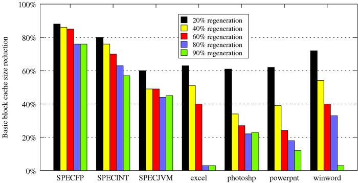
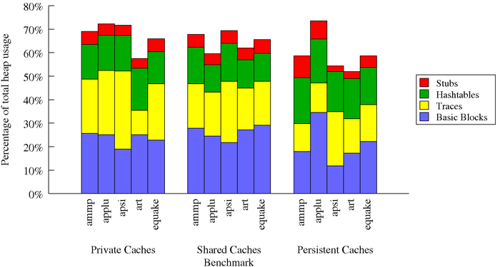
=stackcluster
Just like =cluster, this indicates that there
are multiple datasets, but here we have an extra dimension and the
data is displayed as clusters of stacked bars. Each cluster is itself
like a =stacked dataset, and must be either in
table format or delimited by =multi. The names of the stacked datasets are
delimited as with =cluster and are used in the
legend:
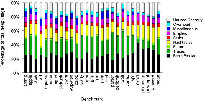
=stackcluster;Basic Blocks;Traces;Hashtables;Stubs
The clusters are then separated (and optionally named) by multimulti=. If any name is given in any multimulti= parameter, then cluster labels are
used. If there is no xlabel=, then the cluster
labels are placed below the x axis tic mark labels. If there are no x
tic marks (=noxlabels) then the cluster
labels are centered under each cluster in place of tic mark labels.
There is no support for putting the cluster labels in the legend.
My script does not support automatically calculating the mean (=arithmean or =harmean) for clusters of stacked bars.
multimulti=
Separates the table or =multi delimited data of a =stackclustertable graph, and optionally
names each cluster with the string after the multimulti=
token. An example:
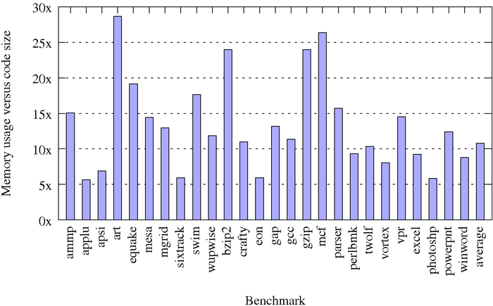
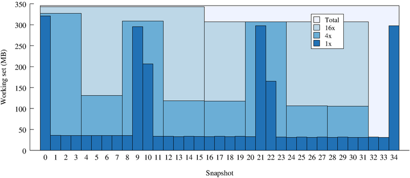
     =stackcluster;Basic Blocks;Traces;Hashtables;Stubs
     =table
     multimulti=Private Caches
     ammp             25.635 23.094 14.780 5.543
     applu            25.035 27.375 14.974 4.913
     multimulti=Shared Caches
     ammp             27.863 18.913 15.536 5.404
     applu            24.501 18.657 11.689 4.720
     multimulti=Persistent Caches
     ammp             17.863 11.913 19.536 9.404
     applu            34.501 12.657 18.689 7.720
=yerrorbars
Specifies that vertical error bars are to be displayed for each datum.
This option is not supported with =stacked
or =stackcluster graphs. The error bar
data follows this directive, in the same format (including optional
non-space delimiter) as =table (non-table-format
error bar data is not supported).
colors=
The script was tuned with sets of colors designed to have maximum
contrast when printed on a non-color printer, yet still look good on a
color display. Non-default color orderings can be chosen using this
parameter. The available color names are:
| color graphs | grayscale graphs | ||||
| black | black | ||||
| grey | grey1 | ||||
| yellow | grey2 | ||||
| dark_blue | grey3 | ||||
| med_blue | grey4 | ||||
| light_blue | grey5 | ||||
| cyan | grey6 | ||||
| light_green | grey7 | ||||
| dark_green | |||||
| magenta | |||||
| red | |||||
Colors should be separated by commas and listed in order, specifying the color for each dataset. An example:
colors=black,yellow,red,med_blue,dark_green
colorset=
Specifies the colors to use via RGB hex values.
Colors should be separated by commas and listed in order, specifying
the color for each dataset. An example:
colorset=#2171b5,#6baed6,#bdd7e7,#eff3ff
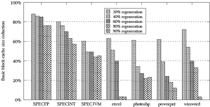
=patterns
Specifies that pattern fills rather than solid colors should be used
to fill the bars. There are 22 fig patterns, which are re-used for
dataset counts higher than 22.
=color_per_datum
Specifies that a different color should be used for each datum. Does
not work with patterns. With clusters, the legend is not very useful.
datadup=
Specifies that for the current data set, N duplicate data entries
should be added for each x axis value that is not specified in the
current data set but is present in another data set. These will have
the same value as the prior specified data value for this data set.
This is useful for building overlapping clustered bar graphs. This
feature is not supported with =stackcluster
graphs. See the datadup sample graph. A
shorter example:
     =stacked;1x;3x
     =stackabs
     =datadup_merge
     0   5257437
     1    590776
     2    581624
     3    581623
     4    581589
     5    581602
     6    581500
     7    581681
     8    581515
     =multi
     datadup=3
     0   5361696
     3   2148480
     6   5063967
=datadup_merge
When datadup= is specified, the duplicate
entries are merged with each other, eliminating lines between them.
This is not supported with pattern fills. The legend is allowed to
overlap the large, merged bars.
| Data Manipulation |
logscaley=
Use a logarithmic scale for the y axis, with the specified base. For example:
logscaley=10
=invert
Each datum is inverted before graphing (datum becomes 1/datum).
=percent
Each datum is transformed to (datum - 1) * 100 before graphing.
This happens after scaling by base1, datasub, or datascale.
=base1
Each datum is transformed to (datum - 1) before graphing.
datasub=
The specified number is subtracted from each datum prior to graphing.
datascale=
Each datum is multiplied by the specified number prior to graphing.
=reverseorder
The benchmarks are placed in the reverse order to their order in the
source file.
=sort
The benchmarks are sorted alphabetically by name.
=sortbmarks
The benchmarks are sorted into SPEC benchmark categories: first SPEC
CPU 2000 FP, then SPEC CPU 2000 INT, then SPEC JVM 98. Any benchmarks
not in these categories are placed at the end. This was very useful
for my thesis.
=sortdata_ascend
The benchmarks are sorted by data value, in ascending order.
For multiple datasets the first dataset is the only one considered.
Any automatic average is placed at the end.
=sortdata_descend
The benchmarks are sorted by data value, in descending order.
For multiple datasets the first dataset is the only one considered.
Any automatic average is placed at the end.
=arithmean
The arithmetic mean is calculated and displayed under the label "mean"
unless specified otherwise by the meanlabel
parameter. The mean is always placed at the end of the benchmarks.
The mean is not supported for =stackcluster
graphs.
=harmean
The harmonic mean is calculated and displayed under the label "har_mean"
unless specified otherwise by the meanlabel
parameter. The mean is always placed at the end of the benchmarks.
The mean is not supported for =stackcluster
graphs.
meanlabel=
Specifies a different label for the arithmetic
or harmonic mean.
min=
Sets the minimum y value displayed. Any values below this are simply
cut off at this value.
max=
Sets the maximum y value displayed. Any values above this are simply
cut off at this value.
=nocommas
Disables the insertion of commas in large numbers, which the script
adds by default.
| Graph Display |
title=
Sets the title of the graph.
xlabel=
Sets the label for the x axis.
xlabelshift=
This is passed straight to gnuplot. The default is "0,-1". An example
is moving the x axis label closer to the x axis:
xlabelshift=0,1
ylabel=
Sets the label for the y axis.
ylabelshift=
This is passed straight to gnuplot. The default is "0,0". An example
is moving the y axis label closer to the y axis:
ylabelshift=2,0
yformat=
Specifies the format for the y tic mark labels. This is passed
straight to gnuplot, which requires a printf-style format specifier
that can accept a double-precision value. Examples:
    yformat=%g
    yformat=%4.2f%%
=norotate
By default, x tic mark labels (not the x axis label) are placed
vertically. This indicates that they should not be rotated and should
remain horizontal.
rotateby=
By default, x tic mark labels are placed vertically, which means
rotating them 90 degrees. The rotation can be controlled through this
parameter, in units of degrees. Negative degress are recommended. For
positive degrees, the
xticshift parameter may be needed to shift the
rotated tic mark labels to lie entirely under the x-axis, and they
may end up not being included in the graph. Future versions of the
script will try to address this gnuplot behavior.
grouprotateby=
By default, group labels for clusters-of-stacked-bars graphs
(see =stackcluster are horizontal.
This option rotates the labels, in units of degrees.
Negative degress are recommended.
xticshift=
This is passed straight to gnuplot. The default is "0,0". An example
is moving the x tic mark labels closer to the x axis:
xticshift=0,1
Note that gnuplot seems willing to move these labels beyond the bounding
box of the resulting graph so be careful moving them away from the axis.
=noxlabels
This specifies that x tic mark labels should not be displayed.
=noupperright
Specifies that the top and right side lines delimiting the graph area
should be omitted.
=gridx
Requests that x grid lines be displayed.
=nogridy
Requests that y grid lines not be displayed (they are by default).
xscale=
Stretches the graph horizontally by the specified factor. Example:
    # stretch the graph horizontally
    xscale=1.2
Note that using "extraops=set size 1.2,1" is not a supported method
of stretching the graph with gnuplot 4.2 and higher.
yscale=
Stretches the graph vertically by the specified factor.
    # stretch the graph vertically
    yscale=1.4
Note that using "extraops=set size 1,1.4" is not a supported method
of stretching the graph with gnuplot 4.2 and higher.
leading_space_mul=
Controls the amount of leading and trailing horizontal space
on the outer edges of the data in the graph. The default is 1.0
plus a per-clustered-bar amount.
This value is multiplied by the bar width (see
barwidth=).
intra_space_mul=
Controls the amount of space between bars or clusters of bars for a
clustered graph. The default is 1.0 plus a small per-clustered-bar
amount. This value is multiplied by the bar width
(see barwidth=).
barwidth=
Specifies the width of each bar. Since the whole graph is scaled
relative to the bar width, usually this parameter does not need to be
changed.
=nolegend
Disables display of the legend.
legendx=
Sets the x location of the legend. The keywords "inside", "right", or
"center" may be used, or a numeric coordinate. The default is
"inside", which requests that the legend be placed inside the graph but
above the bars. When "inside" is specified,
the legendy= parameter is ignored. If not
enough space can be found inside the graph, the equivalent of
legendx=center legendy=top is used as a fallback, placing the legend
above the graph and centered horizontally. Note that using numeric
values may take trial and error to get the coordinates right.
legendy=
Sets the y location of the legend. The keywords "top" or "center" may
be used, or a numeric coordinate. See legendx=
for the defaults and further information.
legendfill=
By default the legend has a white filled background. With no argument,
this option removes the fill altogether. With a color name, it sets the
fill color.
=nolegoutline
By default the legend has a black border. This option removes that
border.
=legendinbg
By default the legend is in the foreground. This option places the
legend in the background, behind the plot.
horizline=
Draws a horizontal line at the specified y value. May be repeated.
font=
Specifies a global font substitution. The script supports the full
set of Postscript fonts that the FIG format supports, which are:
However, this script is post-processing the gnuplot layout of the text using the default font of Times size 10, and will not shift text around, so you may have text running into other plot elements. See also notes about changing the font size (fontsz=).
custfont=<fontname>=<string>
Specifies a different font to be used for a particular string within
the graph. Only a whole string will be matched. The intent is to allow
making specific axis labels bold. The font name must
come from the list of fonts given for font=.
fontsz=
Specifies a different font size to be globally applied. As for
changing the font face (font=), remember that
the script is post-processing gnuplot's layout of the text elements of
the graph, which will not be changed. Thus, increasing the size
may cause overlaps among items on the graph. Also note the bounding box calculation hacks that this script
uses.
legendfontsz=
By default, the legend font size equals the global font size minus 1.
This option overrides that with an absolute font size for the legend.
See also the general notes about changing font sizes (fontsz=).
bbfudge=
Changing the font face or size requires a change in the bounding box of each
text element in the graph. The proper way to calculate that is to
call X library routines to get the text extents, but such an interface
is not standard for perl, so my script currently uses hacks to guess
at the bounding box differences. If you find your resulting graph has
text clipped on the edge of the graph, or you have too much whitespace
at the edges, you can try setting this bounding box fudge parameter.
Its default value is 1.0; a larger value increases the bounding
boxes while a smaller-than-1 value decreases the boxes.
extraops=
Specifies an option to pass straight through to gnuplot, for
fine-grained control over the graph without having to use a separate
tool chain step. I typically use this to place value labels. Unfortunately,
gnuplot does not support setting the font of these labels. Example:
    # add a text label for a value that goes beyond the max= value
    extraops=set label "55" at 2.3,15.6 right
| Examples |
A simple bar graph with a harmonic mean average.
[source file]
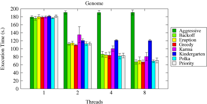
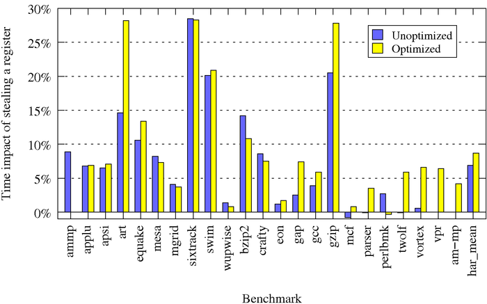
A clustered bar graph with an in-graph legend.
[source file]
The same graph but using patterns rather than solid colors.
[source file]
A simple bar graph using a separate color per datum.
[source file]
A stacked all-100% bar graph
[source file]
A stacked variable-height bar graph.
[source file]
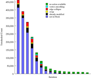
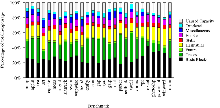
A cluster-of-stacked-bars graph.
[source file]
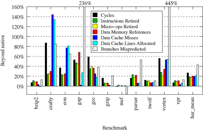
A bar graph with error bars.
[source file]
An example of changing the font.
[source file]
An example of displaying explicit values.
[source file]
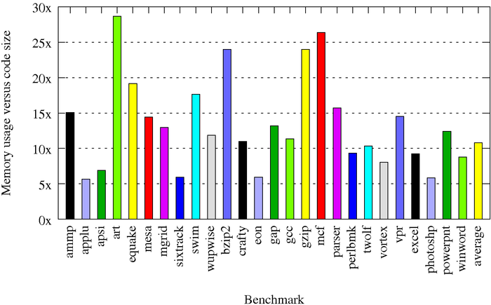
An example of missing data in a dataset. ammp is misspelled as am-mp, resulting in these warnings:
WARNING: missing value for am-mp in dataset 0
WARNING: missing value for ammp in dataset 1
[source file]
An example of overlapping and duplicate items: [source file]
| Converting to Non-Vector Formats |
 Because fig2dev does not perform anti-aliasing, converting
directly to an image format can result in very poor quality lines and
text. This problem is compounded if that image is subsequently resized
without any anti-aliasing, such as by your web browser: a case in point
is the image on the right.
Because fig2dev does not perform anti-aliasing, converting
directly to an image format can result in very poor quality lines and
text. This problem is compounded if that image is subsequently resized
without any anti-aliasing, such as by your web browser: a case in point
is the image on the right.
The solution is to magnify the vector data to at least 4x and then generate a lossless bitmap format, such as PPM or TIFF. From there, have a real image manipulator (such as mogrify) resize it to the size you want. For displaying in html, you should choose the final size at this point -- you cannot really make browser-resizable bar graphs.
Below are my Makefile rules for creating the .png images for this page. Note that mogrify preserves the image's aspect ratio by default, so asking for 700x700 asks for the image to be shrunk so that its longest dimension is 700.
SIZE=700
%.png: %.ppm
	mogrify -reverse -flatten $<
	mogrify -resize ${SIZE}x${SIZE} -format png $<
%.ppm: %.perf
	bargraph.pl -fig $< | fig2dev -L ppm -m 4 > $@
The latest gnuplot patterns contains lines that are much closer together than they used to be. With magnification of 4 or higher they shrink down into gray uniformity (can't see individual # lines), so for a pattern plot, a 2-times magnification seems to work the best.
For including in slides, PowerPoint does perform anti-aliasing, and I found that going straight to png from fig with a magnification of 4x was enough to be able to resize the image in PowerPoint and have it look good at any size:
%.png: %.perf
	bargraph.pl -fig $< | fig2dev -L png -m 4 > $@
| Caveats and Future Work |
Use the Issue Tracker to see the current list of requested features and reported bugs. Below is a list of some key issues and future work with my current script:
transfig-3.2.5-4I've tested prior versions of my script on Fedora Core 5's default packages:
gnuplot-4.2.3-1
transfig-3.2.4-13.3As well as a custom install of gnuplot 4.2.0, for bargraph.pl release version 4.2.
gnuplot-4.0.0-11
| Version History |
The full version history is in the bargraph public repository.
Added datadup= and =datadup_merge for repeated identical values. Added colorset= for specifying colors via a list of rgb values. Fixed gnuplut 5.0 problems.
Added xscale= and yscale= to properly scale graphs on gnuplot 4.2+. Added custfont= feature. Fixed bugs in legend centering, font bounding boxes, and yerrorbars.
Added automatic legend placement, including automatically finding an empty spot inside the graph. Added logarithmic y value support. Added control over leading and intra-bar spacing.
Improved legends with a filled background and outline and bounding box. Added sorting, horizontal line drawing, and other features.
Added gnuplot 4.3 support along with miscellaneous options (rotateby=, xticshift=, ylabelshift=, =stackabs).
Added error bar support along with miscellaneous options (-non-transparent option, =color_per_datum, datascale=, datasub=, =nolegend).
Added support for gnuplot 4.2 (the default fig styles changed).
Fixed bugs in handling scientific notation and negative offsets in fonts.
Added support for clusters of stacked bars, font face and size changes, and negative maximum values.
Added support for custom table delimiters, spaces in names, and the =nocommas option.
This version added pattern fill support and fixed issues with supporting large numbers of datasets.
| Contact |
Bugs or feature requests can be filed using the Issue Tracker.
Other comments can be sent to